【連載】Gatsbyブログのデザインをワードプレスちっくにする手順(その2)「この記事書いた人」っていうComponent作成とサイドバーの一部をスマホで非表示、そして背景色を変更しました。
10月28日追記
Gatsbyブログについて、初noteを書きました。
【完全版】爆速GatsbyでWordPressちっくなブログを作る全手順
こんにちは、筋肉めがねです。
爆速で有名な静的サイトジェネレータのGatsbyで、ワードプレスちっくなブログが作れるんだったら、それはもう安くて早いGatsbyを使いたくなりますよね。という訳で、今回もGatsbyブログのデザインをワードプレスちっくにするため、以下2点の変更を行いました。
以下、本日の目次です。
「この記事書いた人」っていうComponentの作り方
はじめに、どういうモノを作ったかというと、以下のようなモノです。
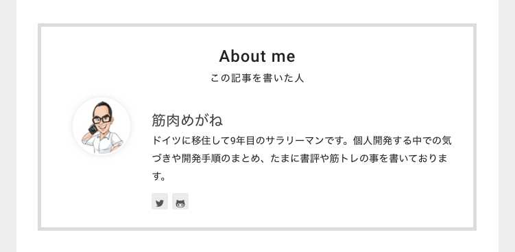
この部品が各記事の最後に表示されるようにサイトに修正を加えました。
Author componentの作成
先ず、componentsフォルダー直下にAuthorというフォルダーを作成し、そこにindex.jsxとstyle.scssを作成しました。
import React from 'react'
import get from 'lodash/get'
import { Link } from 'gatsby'
import Links from '../Links'
import profilePic from '../../pages/photo.jpg'
import './style.scss'

class Author extends React.Component {
  render(){
    const { location } = this.props
    const {
        author,
        subtitle,
    } = this.props.data.site.siteMetadata

    const isHomePage = get(location, 'pathname', '/') === '/'

    /* eslint-disable jsx-a11y/img-redundant-alt */
    const authorPhoto = (
      <div>
        <Link to="/">
        <img
        src={profilePic}
        className="author__author-photo"
        width="75"
        height="75"
        alt={author.name}
        />
      </Link>
      </div>
    )
    const authorBlock = (
      <div>
        {isHomePage ? (
          <h1 className="author__inner_content_profile_author-title">
          <Link className="author__inner_content_profile_author-title-link" to="/">
              {author.name}
          </Link>
          </h1>
        ) : (
          <h3 className="author__inner_content_profile_author-title">
          <Link className="author__inner_content_profile_author-title-link" to="/">
              {author.name}
          </Link>
          </h3>
        )}
        <div className="author__inner_content_profile_author-subtitle" style={{'fontSize':'90%'}}>{subtitle}</div>
        <div>
          <Links data={author} />
        </div>
      </div>
    )
    /* eslint-enable jsx-a11y/img-redundant-alt */
    return (
      <div className="author">
        <div className="author__inner">
          <h2>About me</h2>
          <h6>この記事を書いた人</h6>
          <div className="autho__inner_content">
            <div className="author__inner_content_photo">{authorPhoto}</div>
            <div className="author__inner_content_profile">{authorBlock}</div>
          </div>
        </div>
      </div>
    )
  }
}

export default Author;@import "../../assets/scss/variables";
@import "../../assets/scss/mixins";
.author {
border-left: solid 5px #DCDCDC;/*左線*/
border-right: solid 5px #DCDCDC;
border-top: solid 5px #DCDCDC;
border-bottom: solid 5px #DCDCDC;
padding: 0px 10px;
&__inner {
lost-utility: clearfix;
& h2 {
font-size: 150%;
text-align: center;
letter-spacing: 1px;
margin-top: 1em;
margin-bottom: 1em;
}
& h6 {
font-size: 90%;
text-align: center;
letter-spacing: 1px;
margin-top: -1.7em;
margin-bottom: 1em;
}
&_content{
display: table;
zoom: 1;
box-sizing: border-box;
text-align: center;
color: #3E3E3E;
&_photo{
width: 23%;
padding-right: 1em;
vertical-align: top;
display: table-cell;
box-sizing: border-box;
& img{
width: 100%;
margin: auto;
border-radius: 50%;
border: 2px solid #fff;
box-shadow: 0 0 10px rgba(0, 0, 0, 0.12);
vertical-align: bottom;
max-width: 100%;
height: 70px;
width: 70px;
}
}
&_profile{
text-align: left;
margin: auto;
display: table-cell;
vertical-align: middle;
&_author-title{
font-size: 130%;
text-align: left;
transition: color 0.9s;
margin-top: 1em;
margin-bottom: .2em;
& a{
text-decoration: none !important;
color: #3E3E3E;
font-weight: 500;
}
}
}
}
}
}
@include breakpoint-sm {
.author {
//lost-column: 1/3;
//width: 100%;
border-left: solid 5px #DCDCDC;/*左線*/
border-right: solid 5px #DCDCDC;
border-top: solid 5px #DCDCDC;
border-bottom: solid 5px #DCDCDC;
&__inner {
lost-utility: clearfix;
padding: 0px 20px;
& h2 {
font-size: 150%;
text-align: center;
letter-spacing: 1px;
margin-top: 1em;
margin-bottom: 1em;
}
& h6 {
font-size: 90%;
text-align: center;
letter-spacing: 1px;
margin-top: -1.7em;
margin-bottom: 1em;
}
&_content{
display: table;
zoom: 1;
box-sizing: border-box;
text-align: center;
color: #3E3E3E;
&_photo{
width: 23%;
padding-right: 1em;
vertical-align: top;
display: table-cell;
box-sizing: border-box;
& img{
width: 100%;
margin: auto;
border-radius: 50%;
border: 2px solid #fff;
box-shadow: 0 0 10px rgba(0, 0, 0, 0.12);
vertical-align: bottom;
max-width: 100%;
height: 60px;
width: 60px;
}
}
&_profile{
//font-size: 85%;
text-align: left;
margin: auto;
display: table-cell;
vertical-align: middle;
&_author-title{
font-size: 130%;
text-align: left;
transition: color 0.9s;
margin-top: 1em;
margin-bottom: .2em;
& a{
text-decoration: none !important;
color: #3E3E3E;
font-weight: 500;
}
}
}
}
}
}
}
@include breakpoint-md {
.author {
//lost-column: 1/3;
//idth: 100%;
border-left: solid 5px #DCDCDC;/*左線*/
border-right: solid 5px #DCDCDC;
border-top: solid 5px #DCDCDC;
border-bottom: solid 5px #DCDCDC;
&__inner {
lost-utility: clearfix;
padding: 0px 20px;
& h2 {
font-size: 150%;
text-align: center;
letter-spacing: 1px;
margin-top: 1em;
margin-bottom: 1em;
}
& h6 {
font-size: 90%;
text-align: center;
letter-spacing: 1px;
margin-top: -1.7em;
margin-bottom: 1em;
}
&_content{
display: table;
zoom: 1;
box-sizing: border-box;
text-align: center;
color: #3E3E3E;
&_photo{
width: 23%;
padding-right: 1em;
vertical-align: top;
display: table-cell;
box-sizing: border-box;
& img{
width: 100%;
margin: auto;
border-radius: 50%;
border: 2px solid #fff;
box-shadow: 0 0 10px rgba(0, 0, 0, 0.12);
vertical-align: bottom;
max-width: 100%;
height: 80px;
width: 80px;
}
}
&_profile{
//font-size: 85%;
text-align: left;
margin: auto;
display: table-cell;
vertical-align: middle;
&_author-title{
font-size: 130%;
text-align: left;
transition: color 0.9s;
margin-top: 1em;
margin-bottom: .2em;
& a{
text-decoration: none !important;
color: #3E3E3E;
font-weight: 500;
}
}
}
}
}
}
}読者の方にシェアすることも兼ねてコードを全てのコードを貼り付けましたが、Componentについては、基本的には既にあるSidebar componentの内容から、例えばcopyright, menuなどAuthor componentでは使わないと決めた項目を除いているのみでございます。
また、scssについては、mobile(スマホ)firstで書かれている点だけ意識しながら、こちらもSidebarのscssを参考に書いていきました。
これで、「この記事書いた人」っていう部品ができました。この部品がある事で、サイトトップに容易に遷移できますしtwitterアカウントへも遷移できますね。
ただ、このままだと、スマホでサイトを閲覧した時に、「この記事書いた人」componentの下にサイドバーが表示されています。スマホ閲覧時にはサイドバーの内容を全て表示する必要はありませんので、一部非表示にしましょう。
スマホ閲覧時のサイドバーの一部を非表示にしました。
スマホでサイトを閲覧した時に、サイドバーの内容が全て表示されてしまうと、プロフィールの情報が先ほど作ったAuthor componentと重複してしまいます。それは避けたいところですので、サイドバーの内容のうち、google adのみを残して、他の全ての部品を非表示にしましょう。
どうしてgoogle adのみ残すのか、と言いますと、正直なところ、google adを非表示にしようとすると、以下のエラーが出てしまい、それをどうしても解決できなかったんですよね。
adsbygoogle.push() error: No slot size for availableWidth=0 when i use responsive adsこのエラーを解消させることに約半日費やしてしまい、スピードを意識しているこのタイミングでは元も子もないので、現時点での最善策として、google ad以外の部品を非表示としております。
@import "assets/scss/variables";
@import "assets/scss/mixins";
.sidebar__author {
  display:none;
}
.menu {
  display:none;
}
.links {
  display:none;
}
.sidebar__copyright{
  display:none;
}
@include breakpoint-sm {
  .sidebar__author {
    display: block;
  }
  .menu {
    display: block;
  }
  .links {
    display: block;
  }
  .sidebar__copyright{
    display: block;
  }
}
@include breakpoint-md {
  .sidebar__author {
    display: block;
  }
  .menu {
    display: block;
  }
  .links {
    display: block;
  }
  .sidebar__copyright{
    display: block;
  }
}
これで、スマホ閲覧時には、サイドバー内のほとんどの部品が非表示となりましたので、だいぶとすっきりしました。
では、最後にサイト全体の背景の色を変えましょう。
サイト全体の背景の色を変えました。
活躍されている方々のブログを拝見すると、背景が真っ白というサイトはほとんどありませんね。9割方、背景は薄いグレイで、記事のセクション、そしてサイドバーセクションの背景は白、というコンビネーションを使っているサイトが多い、という印象です。
という事で、サイト全体の背景を薄いグレイに、そして記事の部分、サイドバー部分の背景を白へと変更しました。
html {
  background-color: #EEEEEE;
}
.content{
  background-color:white;
  padding: 1em 0;
  margin: .8em 0;
}
.post-single{
  background-color:white;
  padding: 1em 0;
  margin: .8em 0;
}
.sidebar{
  background-color:white;
  padding: 1em 0;
  margin: .8em 0;
}
これで、有名サイトに似たような背景へとデザインを変更できました。
まとめ
以上で、Gatsbyで作られているこのブログに対して以下3点の修正を加えました。
- 「この記事書いた人」っていうComponentを作りました。
- スマホ閲覧時のサイドバーの一部を非表示にしました。
- サイト全体の背景色を変更しました。
いかがでしょうか。少しずつワードプレスちっくなサイトになってきましたね。
次回は、サイドバーの内容を精査していきたいですね。
それでは、本日は以上です。